Cartographic design
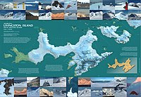
Cartographic design is the fancy name for how maps are made to look pretty and easy to understand. Just like how a chef makes food look really nice on a plate, cartographic designers make maps look really nice on paper or on a computer screen.
These designers use different colors, lines, symbols, and fonts to show information on the map. For example, if you were making a map of a city, you might use different colors to show different areas like parks, buildings, and streets. You might use symbols like little houses to show where people live and little trees to show where there are forests. You might use different fonts to make the name of the city look nice and clear.
Cartographic designers also think about how the map can be easy for people to understand. They might make the streets a little thicker than the buildings or use different shades of colors to show different types of areas. They want to make the map as easy to read and use as possible.
So basically, cartographic design is like putting together a beautiful puzzle of information, where the goal is to help people understand and explore the world around them using pretty pictures and symbols.
Related topics others have asked about: