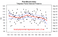
Confidence and prediction bands

Confidence and prediction bands are like lines on a graph. They show how sure we are that something is true. For example, if you wanted to know what the average temperature will be in a week, then you could look at the graph which has the prediction band. The line inside the band shows the temperature we expect it to be. The lines on either side of the line show how sure (or confident) we are that the temperature will be close to that line. The wider the lines are away from the middle line, the less sure we are.
