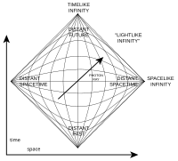
Penrose diagram
Okay kiddo, imagine you're looking at a map of a city. You can see the streets, buildings, parks, and everything in between. But what if I told you that there's a different kind of map that helps scientists understand the way things happen in space? That's where a Penrose diagram comes in!
Instead of showing streets and buildings, a Penrose diagram shows the way things happen in time and space around a black hole. A black hole is like a giant vacuum cleaner that sucks in everything around it - even light can't escape!
Now, imagine you're floating in space and you're close to the black hole. You start moving forward in time, but as you get closer to the black hole, time seems to slow down. Eventually, you reach a point called the event horizon where time seems to come to a stop. From there, things start to get really weird!
If we were to try and draw a map of what's happening around the black hole, it would be really complicated with all sorts of curves and twists. But the Penrose diagram makes it simpler by squishing everything down into a flat, two-dimensional shape.
The diagram shows time going up and down, and space going left and right. Closer to the black hole, time starts to bend towards the black hole so that it looks like it's going diagonal on the diagram. This helps scientists understand how time and space change around a black hole and how things like light and matter behave.
So, basically, a Penrose diagram is a really cool map that helps scientists understand what's happening around a black hole, even though it looks really different from a regular map. Pretty cool, huh?
Related topics others have asked about: