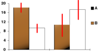
Error bar

Error bars are lines that are drawn on graphs to show the amount of variability or uncertainty in data. They look like vertical lines that extend up and down from data points on a graph. Error bars are usually shown on the top and bottom of data points, but depending on what scientists are trying to show, they might be shown on the left and right sides too. Error bars are usually used when you are comparing data points from different experiments or groups of people. They help show how reliable the results are. For example, if two groups of scientists do the same experiment and get different results, error bars help show how much the results could have varied.
Related topics others have asked about:
