Semi-log plot
Imagine a very tall ladder that goes all the way up to the sky. At the bottom of the ladder, you can see the ground really well, but the higher you climb up the ladder, the harder it is to see the ground. This is because everything looks smaller and smaller the higher up you go.
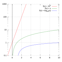
A semi-log plot is similar to this ladder. It's a way to show data on a graph where one axis (usually the y-axis) is shown on a logarithmic scale, and the other axis (usually the x-axis) is shown on a normal linear scale.
In simpler terms, the y-axis (the one going up and down) shows numbers that are increasing by a factor of 10 each time you move up the axis. For example, starting at 1, the next value would be 10, then 100, 1000, and so on. This means that the space between 1 and 10 is the same as the space between 10 and 100, and so on.
The x-axis (the one going left and right) is still shown in a normal way. For example, if you're tracking how many cookies you eat each day over a week, the x-axis would show the days of the week in a normal way.
Semi-log plots are commonly used in science and engineering to visualize data that covers a wide range of values. This is because it allows us to see both the small and large values on the same plot. For example, if you were looking at the population of different countries, a semi-log plot would help you to see the differences between countries with small populations (such as Iceland) and those with large populations (such as China) on the same plot.
Related topics others have asked about: