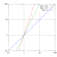
Log–log plot

A log-log plot is like a special type of graph that helps us understand really big or really small numbers. Instead of using regular numbers on the x-axis and y-axis, we use their logarithms (which is just a fancy way of saying we use a power of 10). So if we have a regular number like 10, we can write its logarithm as 1 because 10 to the power of 1 is 10. If we have a really big number like 1,000,000, we can write its logarithm as 6 because 10 to the power of 6 is 1,000,000.
The reason we use this type of plot is that sometimes, when we're dealing with really big or small numbers, it's hard to see patterns. For example, if we were trying to plot the relationship between the population of different cities and their land area, we might have cities with populations from 10,000 to 10,000,000. If we used a regular plot, the points for the smaller cities would look really squished together, and we wouldn't be able to see any patterns or trends.
But if we used a log-log plot, we could spread out those smaller cities and see more clearly how they relate to the larger cities. For example, if we found that the population of a city tended to increase as its land area increased, we would see a sloping line on the log-log plot. This would show us the relationship between the two variables more clearly than a regular plot would.
So in summary, a log-log plot is a graph that uses logarithms to help us see patterns and trends in really big or really small numbers. By using this type of plot, we can make it easier to see how different variables relate to each other, even when the numbers involved are very large or very small.
Related topics others have asked about:
