Seven basic tools of quality
Okay kiddo, do you remember when you were learning how to draw, and you had different types of crayons and markers to make your drawings look nice and neat? Well, when people are making things for real (like cars or toys or food), they also have tools they can use to make sure the thing they're making is good quality – in other words, that it won't break easily, or make people sick, or just not work right. These tools are called the "seven basic tools of quality," and I'll explain what each one is for.
1. Checksheet – This is like a special piece of paper where you can write down things you need to check, and then put a checkmark next to them when you're done. It's kind of like when you're making a grocery list with your parents, but instead of "bananas" and "chips," it might be "did we check that all the car parts are there?"
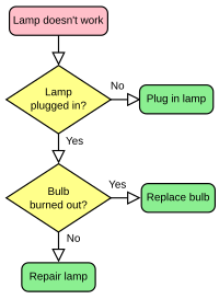
2. Flowchart – This is like a map that shows all the steps involved in making something. For example, if you were making cookies, you might have a flowchart that shows you need to measure out the ingredients, mix them together, shape the dough, bake it, and then cool the cookies. The flowchart helps you see if there are any parts of the process that can be improved or changed.
3. Histogram – This is a kind of graph that shows you how often things are happening. It's like if you were counting how many red cars and how many blue cars drove by your house, and you drew a picture to show the numbers. A histogram can help people making things see if there are certain problems that happen more often than others, so they can work on fixing them.
4. Pareto chart – This is another graph that shows you which problems are the most important to fix first. It's named after a guy named Pareto who noticed that only a few of the things he owned were responsible for most of his problems. A Pareto chart helps people making things see which problems they need to focus on fixing first, so they can save time and money.
5. Scatter diagram – This is a type of graph that helps people see if there's a relationship between two different things. For example, you might make a scatter diagram that shows how hot it is outside and how many ice cream cones people buy. If there's a lot of people buying ice cream when it's hot out, you might notice that those two things are related.
6. Control chart – This is like a special graph that helps people keep track of how things are changing over time. For example, if you were looking at how many cookies your grandma was baking each month, you could make a control chart that shows if the number is going up or down, and if there were any big changes. A control chart lets people see if they need to make any changes to the process to keep things consistent.
7. Cause-and-effect diagram – This is also called a "fishbone diagram," because it looks like a fish skeleton. It's used to help people figure out what might be causing a problem. Imagine you were trying to figure out why your toy car wasn't working – you could draw a fishbone diagram with "battery," "wheels," "motor," and other things, and then make lines between them to show how they're connected. This helps you see which part of the toy car might be causing the problem.
So those are the seven basic tools of quality, kiddo – they all help people making things to make sure they're doing a good job and making things that work well and are safe. Pretty neat, huh?
1. Checksheet – This is like a special piece of paper where you can write down things you need to check, and then put a checkmark next to them when you're done. It's kind of like when you're making a grocery list with your parents, but instead of "bananas" and "chips," it might be "did we check that all the car parts are there?"
2. Flowchart – This is like a map that shows all the steps involved in making something. For example, if you were making cookies, you might have a flowchart that shows you need to measure out the ingredients, mix them together, shape the dough, bake it, and then cool the cookies. The flowchart helps you see if there are any parts of the process that can be improved or changed.
3. Histogram – This is a kind of graph that shows you how often things are happening. It's like if you were counting how many red cars and how many blue cars drove by your house, and you drew a picture to show the numbers. A histogram can help people making things see if there are certain problems that happen more often than others, so they can work on fixing them.
4. Pareto chart – This is another graph that shows you which problems are the most important to fix first. It's named after a guy named Pareto who noticed that only a few of the things he owned were responsible for most of his problems. A Pareto chart helps people making things see which problems they need to focus on fixing first, so they can save time and money.
5. Scatter diagram – This is a type of graph that helps people see if there's a relationship between two different things. For example, you might make a scatter diagram that shows how hot it is outside and how many ice cream cones people buy. If there's a lot of people buying ice cream when it's hot out, you might notice that those two things are related.
6. Control chart – This is like a special graph that helps people keep track of how things are changing over time. For example, if you were looking at how many cookies your grandma was baking each month, you could make a control chart that shows if the number is going up or down, and if there were any big changes. A control chart lets people see if they need to make any changes to the process to keep things consistent.
7. Cause-and-effect diagram – This is also called a "fishbone diagram," because it looks like a fish skeleton. It's used to help people figure out what might be causing a problem. Imagine you were trying to figure out why your toy car wasn't working – you could draw a fishbone diagram with "battery," "wheels," "motor," and other things, and then make lines between them to show how they're connected. This helps you see which part of the toy car might be causing the problem.
So those are the seven basic tools of quality, kiddo – they all help people making things to make sure they're doing a good job and making things that work well and are safe. Pretty neat, huh?
Related topics others have asked about: