Semilog graph
A semilog graph is a special type of graph that we use to show information that changes by different amounts. Imagine you have a toy collection, and you want to show how many of each type of toy you have. However, some types of toys are more popular than others, and you have a lot more of them. A regular graph may not be the best way to show this information, because the numbers can get really big and hard to read.
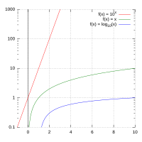
That's where a semilog graph comes in! It helps us see information that changes by different amounts. In a semilog graph, one axis (usually the y-axis) is scaled logarithmically, which means we don't count by adding equal amounts like 1, 2, 3, 4, 5, but instead multiply by equal amounts, like 1, 10, 100, 1000, 10000. The other axis (usually the x-axis) is scaled normally.
Let's go back to our toy collection example. Let's say we want to show how many of each type of toy we have, but we know that some types are much more popular than others. We can put the number of toys on the y-axis using a logarithmic scale, which means that each step up the y-axis is ten times bigger than the previous one. So, if we have 1 toy, it would be at the bottom of the y-axis, but if we have 10 toys, it would be one step up. If we have 100 toys, it would be two steps up from the bottom, and so on.
For the x-axis, we can use a regular scale to show each type of toy. Imagine we have five types of toys: dolls, cars, puzzles, action figures, and stuffed animals. We can put these types of toys on the x-axis, and each type of toy would be in the same place as it would be on a regular graph.
When we plot our toy collection data on the semilog graph, we can easily see which types of toys we have a lot of and which types we don't have as many of. The types of toys that are more popular will have more dots on the higher parts of the y-axis, and the types that are less popular will have dots closer to the bottom.
So, a semilog graph is a tool we use to show information that changes by different amounts. We can use it to see patterns that we might not be able to see on a regular graph. It's like a special kind of map that helps us explore data more easily!
Related topics others have asked about: